AT Design System
Foundations for Consistent, Scalable UI
Staff Product Designer, Design Systems • Interaction Design • Prompt-to-Component Prototyping • Self-Taught Vibe Coder
Summary
The AT Design System is an evolving foundation built to support consistent, accessible, and scalable UI across projects. It reflects an iterative approach to component development, style mapping, and usage guidance. While still in progress, this system is designed with integration in mind, including future use in Vibe Coding workflows to accelerate design-to-code handoff and prototype fidelity.
This case study shares a snapshot of the system's current state and how it’s built to scale.
Foundations & Intent: Why This System Exists
The AT Design System was initiated to unify design efforts across projects by establishing a shared visual language and repeatable interaction patterns. Its primary goal is to reduce design debt, ensure accessibility standards are upheld, and empower teams to design faster without sacrificing quality.
Strategically, the system supports:
-
Scalability – Designed to grow with evolving product needs, component complexity, and emerging patterns.
-
Accessibility-first design – Components are built with usability and inclusion in mind, from contrast to keyboard nav.
-
System thinking – Promotes consistency, reduces ambiguity, and improves decision-making across teams.
-
Developer alignment – Built to reduce friction between design and engineering through better naming, documentation, and handoff practices.
While the system is still in progress, these foundational goals are already shaping how components are authored and refined, with extensibility and future Vibe Coding integration in mind.
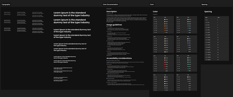
System Structure & Approach
content
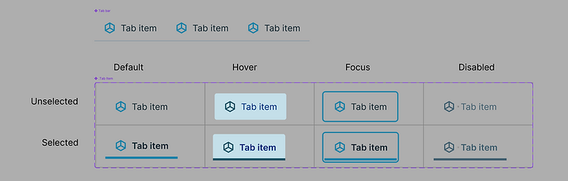
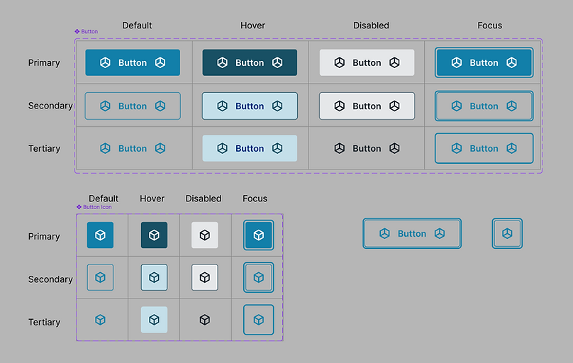
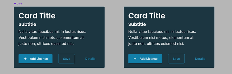
Component Library Preview
This library is an evolving collection of foundational UI components designed to promote consistency, usability, and flexibility. While still in development, each component is being tested for structure, naming clarity, and alignment with accessibility best practices. Components are organized with a focus on reusability and extensibility, supporting a range of use cases from simple UIs to more complex, responsive layouts.
Here are a few of the early components available in the system:
Tabs – Flexible layout support with optional icons and clear hover/focus states
Buttons – Includes primary, secondary, and icon-only variants with tokenized styling
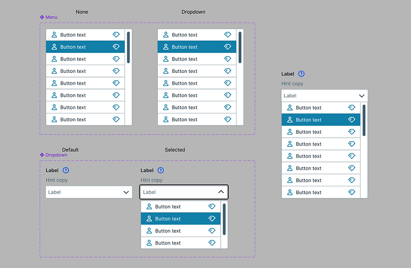
Dropdown Menu – Structured options with support for hover, focus, and future keyboard handling
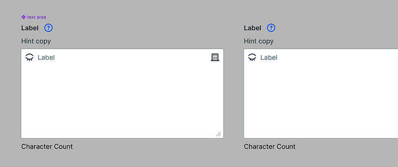
Text Area – Multi-line input with label, hint, and error state support
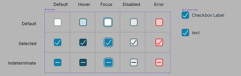
Checkbox – Simple, scalable checkboxes with all standard interaction states
A11y Considerations
Accessibility is foundational to this system’s design philosophy. Every component is being built with inclusive defaults, ensuring keyboard operability, readable color contrast, focus indicators, and semantic clarity.
Where applicable:
-
Components include visible focus states for keyboard users
-
Text elements are tested for legibility across light and dark themes
-
Layouts support screen reader-friendly hierarchy and labeling
-
Tokens are being used to enforce accessible color pairings system-wide
Because this system is still evolving, accessibility remains a continuous area of testing and refinement. The long-term goal is to align components with WCAG 2.2 AA standards and ensure a more equitable experience for all users.
In Progress / What’s Next
This system is still actively evolving. While the foundational components are in place, the next phase will involve refining variants, improving documentation, and stress-testing the system in real design scenarios.
There’s also ongoing work around establishing contribution protocols, building out missing utility patterns, and exploring how this system can integrate with real code, especially through VibeCoding workflows.
Rather than locking anything down too early, the focus remains on building intentionally, gathering feedback, and scaling the system based on actual needs, not assumptions.
🔧 Work in Progress: Live Figma System
This file reflects early component work and in-progress thinking, feel free to explore, but keep in mind it’s not a finished or fully documented system.
Use the embed below to explore the design system directly in Figma. You can click into components, review properties, and inspect how patterns are structured, no Figma account required.
This file is continuously evolving. Some components may be unfinished, undocumented, or still in rough states. Its purpose is to share a transparent view of where the system is headed, not to suggest it’s production-ready.
Interactive Figma file, hover, click, and inspect as needed. Not all components are final or documented yet.
📢 Want to learn more?
Let’s set up a time to chat, reach out via one of the links in the footer below.