Designing Broadcom’s SD-WAN Dashboard in
VeloCloud
Orchestrator
Role: Staff Designer
Platform: VeloCloud Orchestrator (Web-based SD-WAN Management Interface)
🧭 Project Overview
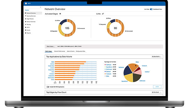
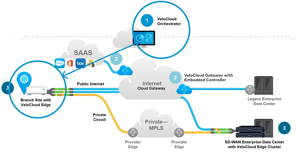
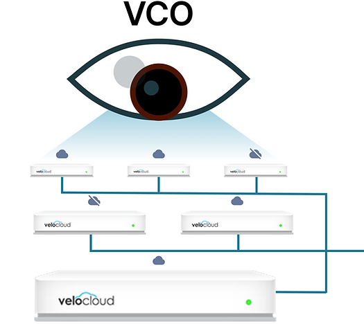
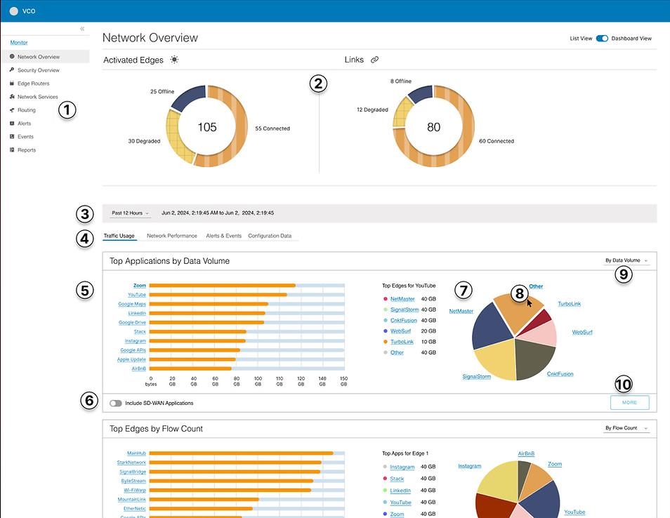
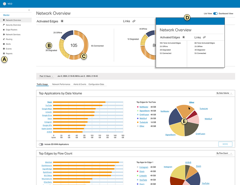
As a Staff Product Designer, I led the redesign of the SD-WAN Network Overview in VeloCloud Orchestrator (VCO), Broadcom’s platform for managing distributed networks. The goal was to create a high-level dashboard that gave admins a quick view of edge router health, without needing to dig through multiple pages.
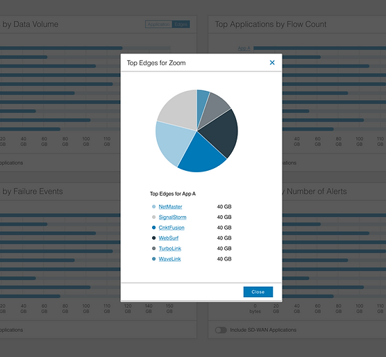
The dashboard surfaced key metrics across applications, routers, and paths, such as:
-
Top applications and edge routers by data volume, flow count, alerts, failures, and backup link usage
-
Most active NVS sites
-
Worst-performing paths based on jitter, packet loss, and latency
Users could still drill down for details, but this standalone view helped them quickly spot issues and take action.
Although the design was well received, the project was paused due to budget cuts after Broadcom’s acquisition of VMware.
📌 Responsibilities
-
Led UX, interaction, and visual design for dashboard overhaul
-
Integrated WCAG-compliant accessibility and inclusive patterns
-
Developed wireframes, prototypes, and design documentation
-
Conducted A/B testing and usability studies with target users
-
Collaborated with engineering, PM, and accessibility teams
📊 Outcomes
-
Improved visibility across SD-WAN networks with contextual analytics
-
Integrated accessibility patterns from the outset
-
Streamlined performance diagnostics and policy deployment workflow
-
Positive user feedback on clarity, efficiency, and flexibility
🤝 Beyond the Handoff
Although the project was paused before full launch, I worked closely with engineers throughout the design process to validate feasibility and interaction logic. I also documented all visual, functional, and accessibility requirements, ensuring that the system could be picked back up in the future without loss of context.
I created a central repository for all decisions and specs, including pattern variations, label strategies, and data hierarchies.
🔄 Design Process
-
Audit & Discovery
Assessed VCO’s current SD-WAN dashboard and identified visibility gaps, ambiguous flows, and WCAG compliance issues.
-
User Insights
Interviewed 4 users (2 with low vision, 2 with color blindness) and consulted internal accessibility experts to identify core barriers.
-
Concept Development
Explored 4 UI models (accordion, modal, section drawer, card drawer) and tested them with users for context retention, efficiency, and readability.
-
Testing & Iteration
Conducted A/B testing of prototypes. Accordion layout with icon support and drill-down filters emerged as the most effective.
-
Documentation & QA
Created spec sheets outlining visual logic, interaction behavior, and accessibility requirements for development and future scaling.
Section Drawer Concept
This concept uses a flyout section that spans across multiple cards or tiles.
Pros
Provides a larger area for presenting item information, allowing for more comprehensive details.
Cons
Potential loss of association due to the increased distance from the triggering element, which may make it harder for users to maintain context.

Modal Concept
Displays detailed information in a modal overlay triggered by a selected card.
Pros
Focuses user attention by isolating detailed content from surrounding distractions.
Cons
Can reduce context, as the modal separates information from its original location, making it harder to maintain the connection.
♿ Built-In Accessibility
Accessibility was embedded from the start, not treated as an afterthought. I flagged WCAG concerns during BRD alignment and validated flows with users with low vision and color blindness.
Key efforts included:
-
High-contrast, accessible color palette
-
Proximity-based labeling and alt-friendly icons
-
Accordion UI with keyboard navigation and ARIA support
-
Optional list view to support non-visual consumption
A. Icons Added – Icons were added to navigation items to improve clarity and visually differentiate content.
B. Proximity-Based Labels – Labels are placed next to the elements they describe, enhancing readability and reducing cognitive load.
C. Visual Patterns – Patterns were introduced to help distinguish between different types of content or status indicators.
D. List View Option – A list view is available as an alternative to image-based dashboard views, supporting different user preferences and accessibility needs.
E. Accessible color palette – Multi-hue palette using industry-tested, accessibility-friendly colors.
✅ Results & Impact
-
Redesigned dashboard enabled faster diagnostics and monitoring
-
Delivered inclusive, WCAG-compliant patterns
-
Received strong feedback during user testing and stakeholder demos
-
Paused due to post-acquisition budget constraints
-
Despite the budget halt, this project was a benchmark in proactive accessibility and dashboard simplification for technical enterprise tools.
📢 Want to learn more?
Let’s set up a time to chat, reach out via one of the links in the footer below.