
Redesigning VMware’s
Internal CPQ Tool (Wireframes)
Role: Senior Product Designer
Platform: Web (Enterprise B2B SaaS, CPQ application used by internal sales teams)
🧭 Project Overview
CPQ stands for Configure, Price, Quote, a tool that helps sales teams quickly and accurately create quotes for products or services. At VMware, the CPQ tool integrates with platforms like Salesforce to streamline product configuration, pricing, and quoting.
We created wireframes and interactive prototypes to simplify navigation, improve task clarity, and modernize the experience. The new design replaced outdated modal patterns, introduced a more intuitive cart system, and added smart search and filtering.
📌 Responsibilities
-
Led the end-to-end redesign effort
-
Researched user needs through interviews and analysis
-
Created wireframes and interactive prototypes
-
Authored rollout plans and design documentation
-
Collaborated closely with PMs and engineers
📊 Outcomes
-
Improved product selection speed and ease of use
-
Enhanced overall usability and workflow clarity
-
Early feedback highlighted better navigation and UI consistency
-
+34% Y/Y Subscription & SaaS Revenue
-
+36% Y/Y Subscription & SaaS ARR*
Problem & Solution Overview
Customers complained about the slow loading times for the product selection and configuration section. They found the UI to be unintuitive and "a bit clunky." Additionally, the product pages sometimes felt disjointed and inconsistent with the overall brand.
The legacy application's modal-based "Add Product" experience negatively impacted performance. Further details and recommendations can be found in the heuristic evaluation.
Challenge
-
Inconsistent UI patterns disrupted task flow
-
Engineer-driven design led to usability issues
-
Navigation lacked structure and clarity
-
Accessibility gaps (e.g., missing labels, poor semantic HTML)
-
Performance slowdowns due to legacy modal workflows
Solution
-
Standardized UI for consistency and scalability
-
Improved navigation and task flows
-
Replaced modal-based product selection for better performance
-
Addressed accessibility issues (WCAG compliance)
-
Designed within Salesforce platform constraints
Mapping & Evaluation
I created solutions based on insights from the following research-based efforts:
-
A 70-page heuristic evaluation
-
Competitive analysis of similar platforms
-
Task mapping to identify critical user actions
-
User interviews with 10 sales reps (6 experienced, 4 new)
Heuristic Evaluation & Competitive Analysis Revealed Issues Such As:
-
Poor button and filter usability
-
Inconsistent data tables and messaging
-
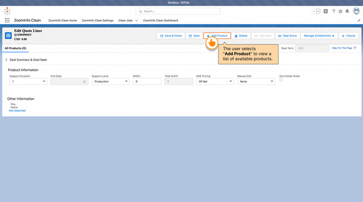
A cluttered "Add Product" modal
-
Lack of clear feedback and progressive guidance


After presenting my evaluation and research, management gave me the opportunity to lead the redesign, starting with the 'Add Products' section, the gateway to the full Add and Configure experience.
Research & Analysis
I began by mapping out the critical tasks that drove the design, identifying how users added and configured products, what mattered most to them, where they got stuck, and how we could improve the experience.

Add Products:
Browse or search the catalog to select items for a quote, with filters and recommendations to speed up selection.
Configure Products: Customize selected items by adjusting options, bundles, or quantities, with built-in rules to ensure accuracy.
Insights from user research helped me uncover key pain points within the CPQ experience for both new and experienced users.
User Interviews Conducted:
-
6 experienced sales reps
-
4 new sales reps
-
Structured interviews with predefined questions around product selection & configuration
-
Open-ended section for additional pain points

The "Add Product" experience was hindered by a slow modal, unclear button styles, and a poorly placed 'no products' message, making selection confusing for users.

The experience was hindered by obstructive filters, inconsistent buttons, a complex search, a flawed data table, empty tabs, and a confusing cart process.


I created user personas to understand key roles and workflows, ensuring the CPQ redesign addressed needs such as faster product selection, clearer configuration steps, and fewer errors.


Design, Test, Iterate, Implement
A/B testing was conducted to understand user issues, allowing us to identify pain points and uncover opportunities for improvement.
Below are some examples of what was designed and tested.
We conducted A/B testing to explore different cart placements:
Left and Right:
Users preferred the cart on the right.
Concerns about content blocking when expanded led to shifting content instead.
Evaluated cart height for accessibility without overwhelming the page.
Bottom:
Placing the cart at the bottom allowed more item details.
Concerns about pushing key content below the fold despite the additional details.

Although the desktop application was used most frequently, I ensured the design was fully responsive and thoroughly tested across tablet and mobile breakpoints.

Key Improvements
-
Intuitive shopping cart with responsive behavior
-
View toggle between card and list views
-
Full product listing with simplified filters
-
Enhanced data tables for large datasets
-
Refined advanced search with type-ahead and autocomplete
-
Improved button layout and feedback messaging
-
Streamlined tab structure:
-
Product List
-
Owned Products
-
Saved Products
-
Wireframe updates


Results
Over the course of two years we can correlate a strong increase in sales colleague's satisfaction with the systems they use, due to more frequent involvement by the user experience design team.
34% Y/Y
Subscription & SaaS Revenue
40–45 %
Subscription & SaaS Annual Recurring Revenue
