Building Wells Fargo’s
Pioneer Design System
Role: Lead Product Designer
Platform: Wells Fargo Commercial Electronic Office (CEO), ~100 Treasury & Wholesale Banking apps
🧭 Project Overview
As Lead Product Designer and a founding member of the Pioneer Design System, I helped establish a scalable and accessible foundation for close to 100 enterprise banking applications within Wells Fargo’s Commercial Electronic Office (CEO) platform.
I led the design of components, patterns, and standards, working closely with engineers, PMs, and accessibility partners through implementation. Within four months, the system reached 40–45% adoption, reduced UI inconsistencies, and saved designers 10+ hours per week through reusable components and better alignment.
📌 Responsibilities
-
Established UX and interaction standards in coordination with accessibility experts to ensure inclusive design.
-
Created scalable documentation for design and engineering
-
Collaborated closely with engineers, PMs, and a11y teams
-
Advocated adoption through education, tooling, and governance
📊 Outcomes
-
40–45% adoption across teams within 4 months
-
10+ hours/week saved per designer
-
20–25% improvement in cross-functional alignment
-
~100 Treasury & Wholesale Banking apps supported
-
Enhanced accessibility compliance

🤝 Beyond the Handoff
My work didn’t stop at design delivery. I partnered with engineers through QA and implementation to ensure each component worked as intended. I also collaborated with PMs to integrate the design system into their development roadmaps.
I co-created the internal Pioneer Design System website as a source of truth, housing documentation, spec sheets, and live updates. I hosted open studio sessions, provided toolkits, and offered support via office hours to foster adoption.
🔄 Design Process
-
Audit & Discovery
Conducted audit of nearly 100 applications and identified shared UI needs across commercial banking use cases.
-
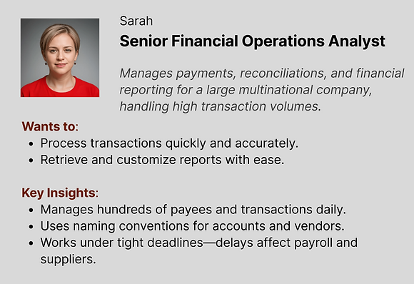
User Insights
Developed personas and user flows focused on task-driven employees managing high-stakes, time-sensitive operations.

-
Component Design
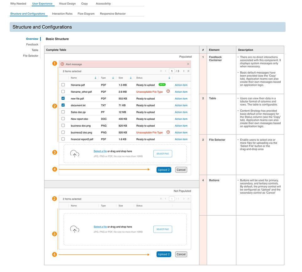
Created core components in Figma with variables, shared styles, and accessibility baked in.
-
Testing & Feedback
Partnered with internal design teams and customers at live events to validate patterns and iterate.
-
Documentation & Toolkit
Built a central documentation site with guidelines, QA tools, and prototyping kits to support engineers and designers.
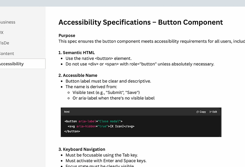
♿ Built-In Accessibility
Accessibility was integrated into every component from the start. I collaborated with specialists to ensure compliance with WCAG and Section 508. Design specs included keyboard navigation rules, screen reader guidance, contrast checks, and motion guidelines.
Our work supported users who rely on screen readers, magnification tools, voice control, and cognitive simplification. We used internal audits, testing labs, and customer feedback to refine accessibility continuously.
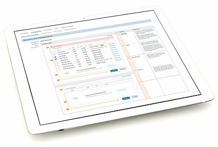
🧱 Component Specs & Figma
We used Figma as the source of truth for design components, leveraging component properties, shared styles, and tokens to support theming and scalability. However, the majority of detailed documentation was maintained in Confluence to ensure consistency across teams.
Each component specification in Confluence included:
-
Business justification
-
UX and interaction behavior
-
Accessibility requirements and considerations
-
Visual design specifications
-
Content strategist notes (e.g., tone, microcopy, localization guidance)
-
Developer notes and implementation considerations
-
Responsive behavior and edge cases
-
Usage examples and do’s & don’ts
This centralized documentation approach enabled faster onboarding, improved cross-functional alignment, and reduced implementation gaps.
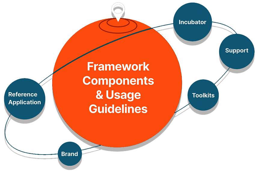
🌐 The Pioneer Design System Ecosystem
-
We built the Pioneer Design System as a fully supported ecosystem, including:
-
Component Library & Guidelines
-
Branding & Theming Toolkit
-
Reference App for QA Testing
-
Rapid Prototyping Kits
-
Developer Toolkits
-
PDS Website for central documentation and support


📢 Want to learn more?
Let’s set up a time to chat, reach out via one of the links in the footer below.