Orbit: A Vibe-Coded Product Interface
From legacy CPQ wireframes to a modular UI built with React and Tailwind
Staff Product Designer, Design Systems • Interaction Design • Prompt-to-Component Prototyping • Self-Taught Vibe Coder
View the Vibe-Coded Prototype
Watch the Full Walkthrough
A modular CPQ UI built with React, Tailwind, and Vibe Coding principles.
Summary
This project began as a strategic CPQ redesign during my time as a Staff Product Designer. After the original effort was sunset due to organizational changes, I revived the vision independently, building a fully functional prototype under a new name: Orbit.
Orbit represents my exploration into Vibe Coding, an emerging design-development workflow that combines systems thinking, AI-assisted component generation, and manual scaffolding. I used tools like Figma, v0.dev, React, and Tailwind CSS to translate early wireframes into a working interface, complete with dark mode, product filtering, tab toggles, and cart logic.
➤ Why I Rebuilt This
The Orbit interface began as part of a larger CPQ redesign effort I led while working as a Staff Product Designer. Although that project was eventually sunset due to company-wide restructuring, I wasn’t ready to let the vision go.
Instead, I took it as an opportunity to push my skills further, not just as a designer, but as a builder. I wanted to explore how far I could take a product idea using emerging Vibe Coding methods: combining design system thinking, AI-assisted UI generation, and real component-based development.
This case study reflects that journey, from dormant wireframes to an interactive prototype I built myself using React, Tailwind CSS, and tools like v0.dev. While I don’t present myself as an engineer, I took this on as a systems-oriented designer: someone who wanted to deeply understand how interfaces work in code, not just in theory. This wasn’t a handoff. It was a re-imagination, powered by curiosity, practice, and a commitment to turning static ideas into living UI.
Process Overview
➤ From Design System to Working UI
The Orbit interface came to life through a 3-step workflow that combined design system thinking with Vibe Coding tools and local development:
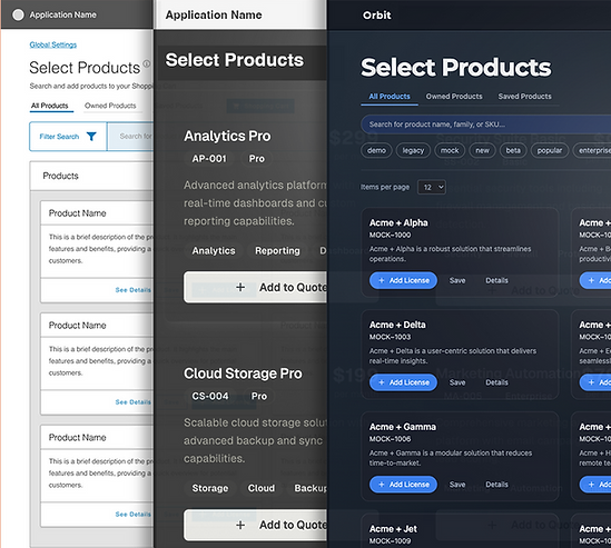
1. Design Exploration in Figma
I began with simple wireframes to establish layout hierarchy, navigation structure, and UI zones for configuration, cart access, and filtering. These were built using a base design system I developed, incorporating tokens like spacing, typography, and color variables.
While the original project didn’t make it to high-fidelity implementation, Figma helped me quickly block out responsive layouts and start to think in component terms, what would need to be modular, reusable, and adaptable across breakpoints.
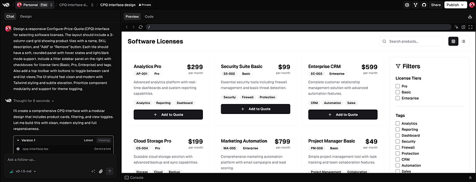
2. Prompt-to-Component UI Generation (v0.dev)
I explored layout scaffolds in v0.dev to get a feel for how my Figma wireframes could be structured in code. While most of the final UI was manually built and customized in VS Code, v0.dev accelerated my learning by translating interface prompts into real React + Tailwind patterns. It helped me understand component boundaries and responsive layout behavior without starting from a blank file making it easier to bridge the gap between visual design and system-level UI thinking.
3. Local Development with React + Tailwind
Once the core layouts were ready, I scaffolded a local Vite project using React and Tailwind CSS. From there:
-
I built modular components (e.g. Card, Tile, ListView, CartPanel)
-
Structured state management for product tabs, saved items, cart behavior, and theme toggling
-
Created responsive logic for view modes and filter panels
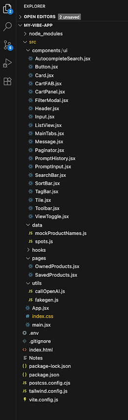
I organized the project into a clear directory structure (src/components/ui, pages, hooks, etc.) to keep the system scalable and maintainable.
➤ Folder Structure
The project is organized into key directories:
-
components/ui: Shared, reusable UI components like Header, Tile, ListView, and CartPanel
-
data: Includes mock product info (names, SKUs, tags, descriptions)
-
hooks: Custom hooks to keep logic modular (optional, future use)
-
pages: If needed, this supports route-level page logic (future-ready)
-
utils: Could house helper functions for filtering, formatting, etc.
Key Component Examples
Each UI element lives in its own file for clarity and reusability:
-
Header.jsx: Sitewide top bar with theme toggle and dropdowns
-
Tile.jsx: Product card for grid display
-
ListView.jsx: Alternate compact layout
-
CartPanel.jsx: Slide-out overlay with cart controls
-
FilterModal.jsx: Mobile-friendly filter interface
How I Thought About It
Instead of scattering logic across one file, I followed a component-first mindset. Each piece of Orbit was designed like a mini system:
-
Presentational layout
-
Stateful interaction
-
Reusable logic
This made it easier to reason through dark/light mode switching, cart updates, and filter behavior — even with limited dev experience.
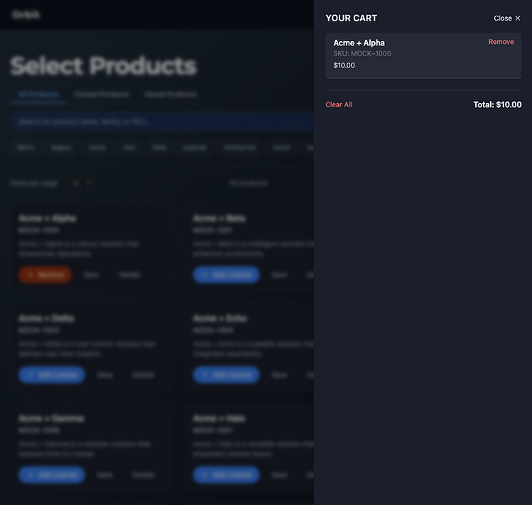
What I Built: Feature Highlights
I rebuilt core parts of the product selection workflow to explore how real code could support interaction logic, accessibility, and layout responsiveness, all based on my original wireframes in Figma. Each UI feature here was coded by hand using React and Tailwind CSS.
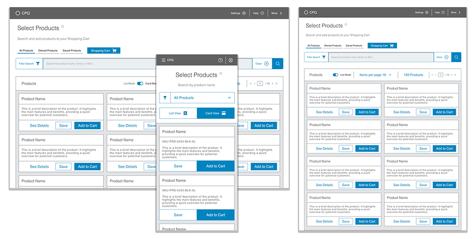
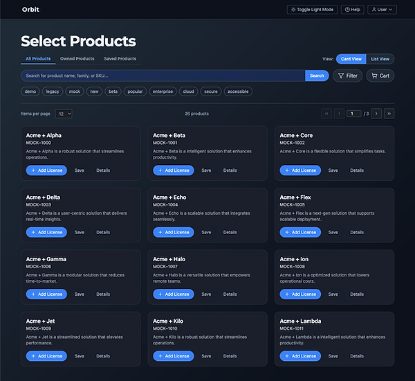
➤ Tabbed Product Views
Orbit supports three product tabs:
All Products, Owned, and Saved.
These are built using a modular tab system that filters and renders products based on cart state or saved preferences. The active tab persists across interactions, and updates are instant, no page reloads.

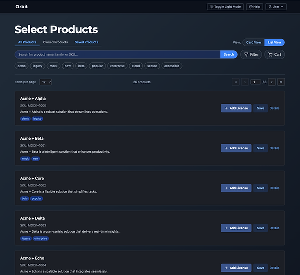
➤ View Toggle: Card vs. List
To support different browsing behaviors, I added a toggle that switches between Card view and List view.
-
Card View prioritizes quick scanning with visuals and summaries
-
List View shows denser rows with icons, tags, and actions
This challenged me to reuse layout logic across two visual formats — without duplicating component code.
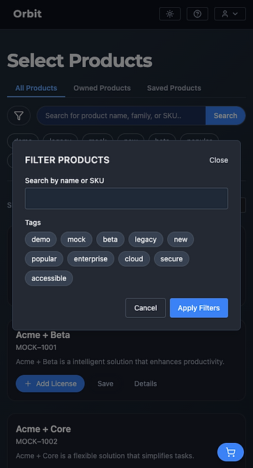
➤ Filter Modal + Search
Filter includes:
-
Autocomplete search tied to product names
-
A filter modal with tag-based selection
-
Instant list updates — no manual "submit" required
The modal behaves responsively:
On desktop it opens as a panel, while on mobile it becomes a full-screen overlay. It was designed for tap targets and gesture space.
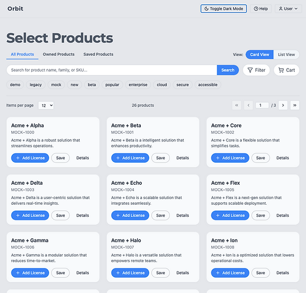
➤ Theme Toggle: Light/Dark
I added a dark/light mode toggle powered by Tailwind’s class strategy. It updates the document root class and applies theme styles instantly.
This required careful planning around color variables, contrast, and visual hierarchy across both themes.
➤ Cart Logic + Slide-out Panel
Products can be added or removed with contextual buttons. These trigger:
-
A live cart count in the FAB + header
-
A slide-out cart panel with smooth entry/exit
-
Dismissible status banners confirming user actions
What I Learned
Before this project, I had never built a real UI in code. I was familiar with design systems, components, and accessibility, but implementing those ideas in actual logic, layout rules, and state management was completely new.
Through Vibe Coding, I learned to:
-
Translate Figma decisions into component behavior
-
Scaffold and debug in VS Code with ChatGPT as a pair
-
Use tools like Vite, Tailwind, and modular folder structures
-
Think in code-level systems, not just visual ones
I also began to develop a feel for how real products are assembled: how views connect, how state flows, and what makes interfaces truly adaptive, not just responsive in layout, but responsive in logic.
This wasn’t about becoming a front-end engineer. It was about making my design practice more full-stack, bridging design, prototyping, and implementation in a way that makes collaboration with Devs faster, more thoughtful, and more scalable.
What’s Next
Orbit was a personal milestone, not just because I built a coded prototype from scratch, but because it changed how I approach product design.
I now think about:
-
Component logic while designing in Figma
-
State flow and conditional UI while mapping interactions
-
How design systems translate into utility classes and theme tokens
I’m already planning my next Vibe Coding project: a more dynamic interface built around a design system I’ve started prototyping. This time, I’ll be exploring:
-
Component generation from Magic Patterns or Lovable
-
Direct Figma-to-code workflows with naming conventions baked in
-
More structured planning docs (like mini PRDs) to define scope and logic
For me, this work isn’t about changing careers, it’s about expanding my toolkit. The goal is to become the kind of designer who can work fluently with engineers, prototype real ideas, and bring design systems to life from both sides of the screen.
📢 Want to learn more?
Let’s set up a time to chat, reach out via one of the links in the footer below.